
The field of mathematics allows us to understand the world around us in terms of numbers. By organizing numbers into meaningful patterns, one can easily make logical conclusions about complex problems. For instance, by recording the time of the monsoon for several years, our ancestors became more efficient in agricultural practices. In other words, we can understand almost anything happening around us by collecting and analyzing data associated with that event. The understanding can further be enhanced by representing the numerical data in the form of visually differentiable patterns. The graphical representation that organizes a group of data points into user-specified ranges is known as a histogram. These ranges of values are called classes or bins. The frequency of the data that falls in each class is depicted by the use of a bar. The higher that the bar is, the greater the frequency of data values in that bin. The horizontal axis of a histogram is a number line containing classes or bins of uniform intervals. The above description can be understood with the help of the following example.
Suppose you own a school uniform shop, and you want to stock up the supply based on the age of the students residing in your locality. You can go through your bill book and write the ages of all the customers as follow:
Age Data: 5, 5, 7, 6, 8, 11, 13, 11, 14, 12, 15, 23, 24, 15, 14, 14, 15, 10, 24, 16, 16, 17, 11, 19, 23, 14, 18, 16, 15, 19, 14, 9, 11, 10, 12, 10, 10, 16, 13, 14, 12, 15, 23, 24, 15, 14, 14, 15, 12, 24, 16, 16, 17, 18, 19, 23, 18, 9, 23, 14, 11, 16, 6, 13, 11, 14, 12, 15, 22, 22, 15, 14, 14, 15, 10, 5, 7, 6, 8, 6, 13, 11, 14, 12, 15, 23, 21, 15, 14, 14, 15, 5, 7, 6, 8, 6, 13, 11, 14, 12, 15, 9, 24, 15, 14, 14, 15, 12.
The above data can be categorized into groups as follow:
| Age Groups (Class-Intervals) | Number of students (frequency) |
|---|---|
| 5-8 | 16 |
| 9-12 | 24 |
| 13-16 | 46 |
| 17-20 | 8 |
| 21-24 | 14 |
This data can be graphically represented as:

It is clear from the above histogram that most of the student in your locality falls under the age-group 13-16. The visualization of numeric data enables you to easily decide and communicate your stock demand. Before we discuss other areas where one can use histograms, let’s first understand the basic elements and type of histograms.
Elements of a Histogram

Title
The title of a histogram is what gives an insight into the data visualized on the graph. It summarizes the information depicted on the histogram chart. With a title on a histogram chart, a third party can easily depict what the graph is about. In the illustration above, the title of the histogram chart is Histogram
Axes
A histogram chart has two axes, the vertical and the horizontal axis. The frequency is shown by the vertical axis on the histogram graphic, whereas the class intervals or bins are shown by the horizontal axis. These two axes are generally labeled with what they represent, giving the histogram graph’s title additional meaning. The horizontal (x) axis depicts the value scale used to calculate the class interval. Each of these axes is frequently labeled with a description of the type of data plotted on it. The horizontal label is Bin, and the vertical label is Frequency.
Bars
The bars are the principal visual representation of the data set in a histogram graph. The number of times values fall in each class interval is indicated by the rectangular bars on a histogram. The frequency is represented by the height of the bars, while the interval is represented by the width of the bars. The breadth of histogram graphs with uniform class intervals is usually the same.
Scale
The scale of a histogram is a set of numbers used to measure or quantify the dataset on the graph. This is part of what determines the width and height of each rectangular bar on the histogram chart.
Legend
A legend is a tool to help explain a graph. It is most commonly added to those histograms that have more than one variable. It usually tells about the method used for gathering the data.
To use a histogram, we simply require a variable that takes continuous numeric values. This means that the differences between values are consistent regardless of their absolute values. The way that we specify the bins will have a major effect on how the histogram can be interpreted. When a value is on a bin boundary, it will consistently be assigned to the bin on its right or its left (or into the end bins if it is on the endpoints). Different types of histograms provide simple but effective solutions to different process issues.
Types of Histogram
Histogram graphs are classified into different types based on the distribution of the rectangular bars on the graph. The shape of the frequency distribution in a particular type of histogram can offer a better understanding of the variations.
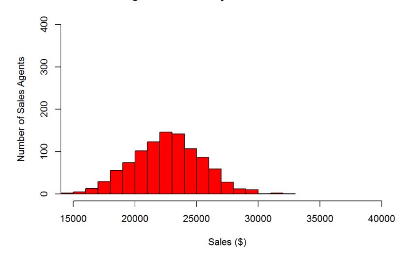
Normal Distribution

A histogram chart is said to be of the normal distribution if it is bell-shaped. It is a symmetrical arrangement of a data set that has only one peak in the distribution with exactly similar data distribution on both sides.
Bimodal Distribution
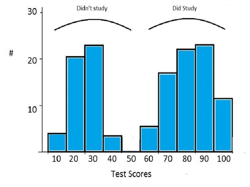
A bimodal distribution is an outcome of combining two different processes in one dataset. This distribution contains two different normally distributed graphs with two different peaks. In a bimodal distribution, the data should be separated and analyzed as separate normal distributions.
Skewed Distribution

A skewed distribution is an asymmetric graph with an off-center peak tending towards the limit of the graph (or away from the tail). There are two types of skewed distributions: right-skewed distribution and left-skewed distribution. As the name suggests. the distribution which has a larger number of bins to the right side of the average is said to be right-skewed distribution, whereas the one with a larger number of bins to the left side of the average is said to be left-skewed distribution
Random Distribution

This type of distribution lacks a particular pattern and produces several peaks. Hence, it is also referred to as multimodal distribution. Random distribution is usually generated when a dataset containing variables with different properties is combined. In this case, the data should be sorted and separately analyzed.
Uses of Histogram

The histograms are mainly used to display and organize a large set of measurements or numerical data in a user-friendly manner. A histogram will make it easy to see where the majority of values fall on a measurement scale, and how much variation is there among those values. The objectives for creating a histogram can be categorized as follow:
- Summarizing large data sets graphically.
- Comparing the results with predefined specification limits or goals.
- Seeing whether a process change has occurred from one time period to another.
- Determining whether the outputs of two or more processes are different.
- Communicating the degree of objectives.
- For strategic decision-making and predicting outcomes.
These objectives are achieved by using histograms. Let’s discuss a few applications of histograms that we may come across in our daily life.
Electoral Data Analysis

Whether it is about choosing the representative of your country or making a simple opinion poll, a histogram is one of the best formats to display the analysis. It is important to note that the graphical representation of votes gained by a particular candidate or party is a bar graph and not a histogram as one of the axes in such a graph represents the candidate, which is not a numerical class interval. Nonetheless, data scientists and statisticians make use of histograms to display several numerical evaluations such as the vote fraction of a specific party in all polling stations, distribution of the number of valid votes per polling station, distribution of the number of people engaged through election campaigns, voter’s arrival time analysis, etc. All these factors, when displayed through histograms, help candidates and corresponding parties to make better strategies for their election campaigns.
Weather Forecast
Meteorological departments all around the world record several climate parameters such as rainfall, snowfall, temperature, etc., and they make use of histograms to study the variations among those parameters. This enables them to anticipate future similar events, whether floods, droughts, storms, frosts, or snowfalls. Moreover, meteorologists can even use histograms to map when lightning strikes, and this visualization technique helps them understand the data in new ways.
Disease Tracking

Among the essential stages of epidemiological research, one of the most important is the identification of data with which the researcher is working, as well as a clear and synthetic description of these data using graphs and tables. Histograms are one of the most essential tools in epidemiology when it comes to review and display the data related to an acute public health event (any outbreak or other rapidly evolving situation that may have negative consequences for human health and requires immediate assessment and action). With a large amount of data, it is more convenient to create class intervals and sort the data accordingly. The class interval may include several mutually exclusive parameters such as age, blood pressure, body temperature, exposure time, etc.
Stocks Trading

Most of us have heard about the rise and fall in the prices of the shares in the stock market. Although investing in the stock market is always subject to market risks, one can understand the probable nature of the stock market by deploying mathematical formulas and make good returns from it. Technical traders study the histograms representing the economic state of the stocks over time. Based on that data, they create new histograms that represent the promising assets. Large sets of data can be overwhelming and confusing, so traders use statistical tools that help collect, analyze, interpret and present data. One of the most prominent histograms in the stock market is the moving average convergence divergence (MACD) histogram, a technical indicator that illustrates changes in the strength, direction, momentum, and duration of a trend in a stock’s price.
Business Analysis
Business analysis is the discipline of recognizing business needs and findings solutions to various business problems. In simpler words, it is a set of tasks and techniques which work as a connection between stakeholders. An organization can leverage business analysis to achieve its strategic goals by identifying and implementing specific changes. Developing an accurate, efficient, and robust visual tracker is always helpful to improve organizational performance. When it comes to quality improvement in your business, the histogram may help you in a variety of ways, whether on a small or large scale. For starters, they can assist you in visualizing data in a way that is easy to understand and explain difficult ideas to others. This will ensure that everyone in the organization, not only higher-ranking executives with extensive data analysis skills, understands the repercussions of specific actions. That’s why histograms are so ubiquitous in business presentations and other comparable settings, and there’s a strong reason to start using them if you haven’t already.
Histogram in Photography

If you like taking photos, you might have noticed that the image on the screen of your camera can appear different under different lighting conditions. While this may not be a problem for general use, professional photographers cannot take the chance of being deceived by the ambiance of the atmosphere while developing photos. To overcome this problem, photographers make use of histograms. In photography, a histogram is a graph showing the distribution of light in an image. Most cameras are capable of displaying a histogram for each image stored on the camera’s memory card. Some cameras even allow you to see a live histogram before you take the shot. The camera creates this graph by converting the image to greyscale and divides it into 256 levels of brightness: starting at 0 (representing pure black) and up to 256 (representing pure white). The camera then analyzes each pixel of the image and plots its brightness information into what becomes the histogram chart. The height of the histogram tells how many pixels there are of that specific tone. A proper exposure captures the lights and darks of your photo in a way that looks real, or as close to real as what you actually see. By studying and manipulating the heights of bars, photos can contain the right amount of blacks, shadows, mid-tones, highlights, and whites to make it look realistic.